


Sep 221 min read


Aug 188 min read


Jul 178 min read

Stocks have continued to show resilience, but geo-political developments and long-term trend changes could be challenging the long-term bull market in stocks.
Could precious metals start to take over the lead relative to stocks?
Despite the war in Iran, volatility in AI stocks, rising interest rates and general dysfunction across the globe, stocks have continued to quietly push to new all-time highs.
While the S&P 500 index is dominated by big tech companies like Apple, Amazon, Google and Nvidia, the smaller companies have been showing outperformance this year.
In 2026, bigger stocks, such as Apple and Amazon, have been incredibly volatile, at times moving 15% or more in a single day.
Generally speaking, they are higher for the year, but market leadership not being dominated by the S&P 500 is a big change over the past decade.
Let's focus on mid-cap stocks.
The first chart below is the ticker IJH.
What is remarkable about this chart is just how unremarkable it is.
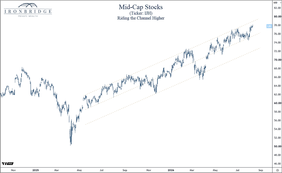
This chart goes back to late 2024.
There was increased volatility in early 2025 as tariffs and Trump blustered their way onto the scene. This is shown in the decline on the left-side of the chart.
After that volatility, prices have grinded higher.
Sure we had a normal 10% correction earlier this year, but other than that the smaller companies have been persistent.
Small caps and mid caps to continue to outperform larger stocks, and our system suggest this could continue throughout the remainder of this year and into 2027,
While the trend is up right now, it is starting to weaken based on many underlying data points.
Higher prices could easily occur over the next year or two, but don't be complacent, as there are a number of landmines that can throw off this bull market.
One of the bigger changes in portfolios that have occurred over the past year is the reduction of US stock exposure in favor of gold, silver and copper.
What is behind this trend?
Primarily, we are seeing central banks around the world switch from using US Treasury bonds as the reserve asset of choice to gold.
Earlier this year, gold surpassed treasuries as the largest holding across global reserves, as shown in the next chart.
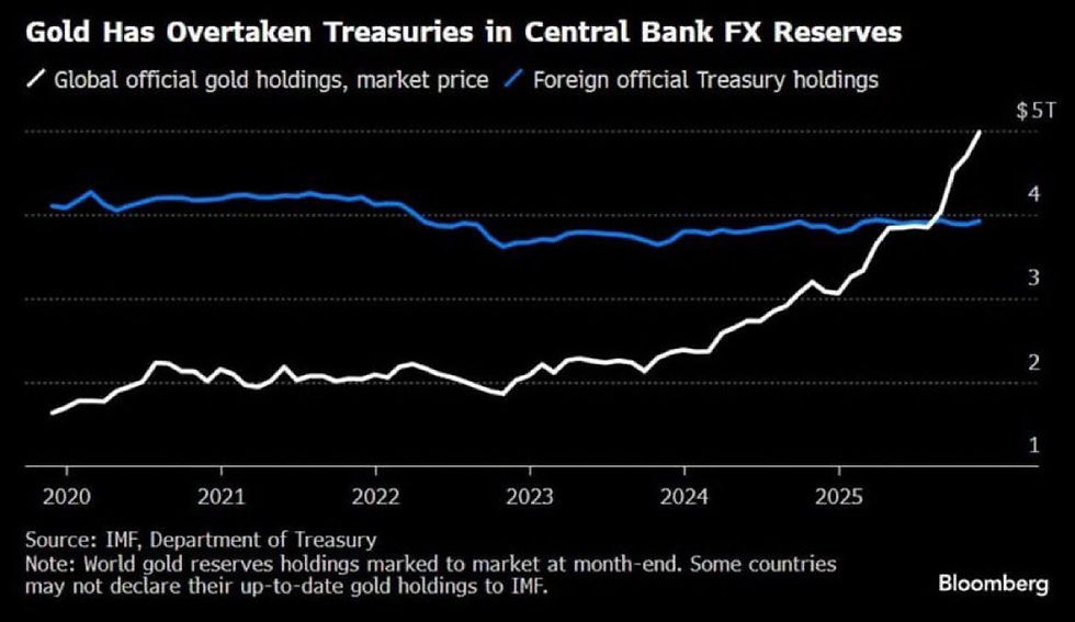
Since the end of the gold standard in the early 1970's, central banks have accumulated US Treasury bonds as the reserve asset of choice.
But recently, that trend has changed.
They are now buying gold instead of US Treasuries.
And for the first time in over 50 years, gold has officially overtaken treasuries as the largest reserve asset.
China's switch from treasuries to gold is even more pronounced than the rest of the world, as shown in the next chart below.
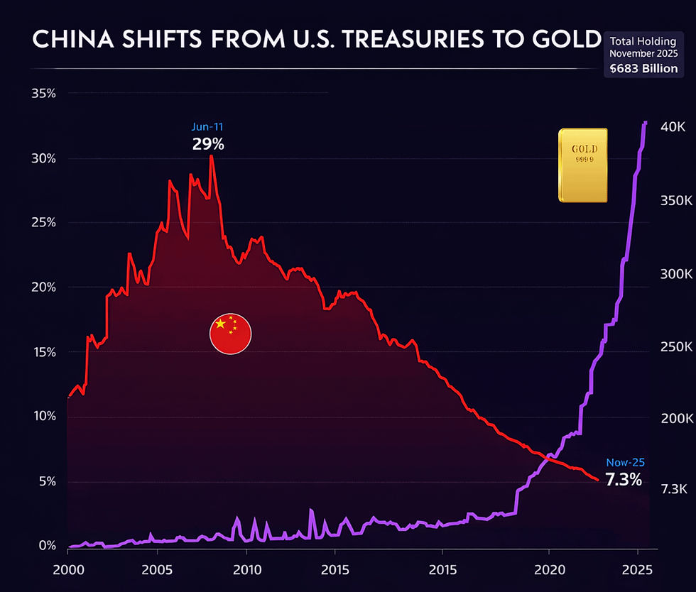
No need to overthink this one.
Central banks are buying gold at levels never seen before.
This increased demand should support prices for a number of years into the future if the current pace of buying stays at these levels.
The companies that mine gold also look incredibly attractive by themselves.
Gold miners stocks are the cheapest they have been in 50 years, as shown in the next chart.
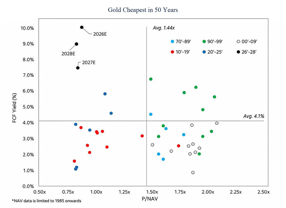
This chart shows Free Cash Flow Yield on the left side of the chart (up and down), with a valuation metric (Price-to-Net Asset Value) left to right along the bottom of the chart.
Free cash flow yield (FCF Yield) is a sophisticated-sounding term that helps show the health of the underlying company. Read more about FCF Yield here: https://www.investopedia.com/terms/f/freecashflowyield.asp
Put more simply, a high FCF Yield means that the company is generating a LOT of cash.
Free cash flow is the excess cash a company generates after it pays all of its expenses.
Turning it into a "yield" simply takes the value of that cash flow and divides it by the market cap, or how big the company is.
So the FCF yield of 10% for 2026 says that these companies are generating cash equal to 10% of their market cap.
These are huge numbers.
Normal FCF yields are typically 3-5% for a fairly valued company. Readings of 7-8% typically signal a company that is substantially undervalued.
A FCF yield of 10% is off the charts.
The estimates for 2026, 2027 and 2028 put gold stocks with some of the lowest valuations in history,
Just because stocks are cheap doesn't make them good investments.
But when you combine having the lowest valuation in history with having one of the highest free cash flow yields in history, you start to get a very compelling investment story.
Especially when the overall market cycle is potentially shifting to favor commodities over stocks, owning gold stocks right now is compelling.
Especially when they are scoring well in our system, have the fundamental drivers supporting revenue and profitability, and the charts look good, they should have a place in your portfolio.
The upside in precious metals and their associated stocks look much bigger than the upside in broad equity markets.
They just might not move in lock-step with stocks.
It's not just gold and gold miners that are attractive. So is silver.
The silver chart has one of the most powerful setups in recent history.
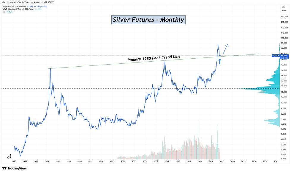
The technical picture on this chart is incredible.
This chart shows the price of silver from the mid-1970's to today.
Rarely do we see charts present a clean pattern over multiple decades like we do in this chart.
Chart patterns are visual representations of human behavior in financial markets...behavior that repeats over time.
This repeated behavior allows you to compare previous market environments with the current one and attempt to predict price behavior.
The setup on the silver chart is historic.
This particular setup is called a "Cup with Handle" chart pattern.
Read more about it here:
Generally speaking, here is an illustration of the pattern:
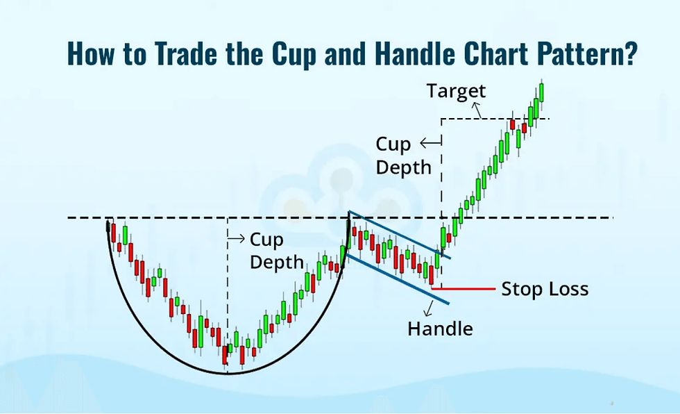
The pattern looks like a coffee cup, with its handle on the right.
The dashed line is the "top of the cup".
Once the price on the top of the cup is exceeded after the handle part is done, then prices tend to skyrocket to a height equal to the cup depth.
Technical patterns like this are not guaranteed to play out as expected, but statistically speaking a bullish cup-and-handle pattern breaks higher roughly 75% of the time.
Let's look at the long-term silver chart again, but this time looking for the cup-and-handle pattern.
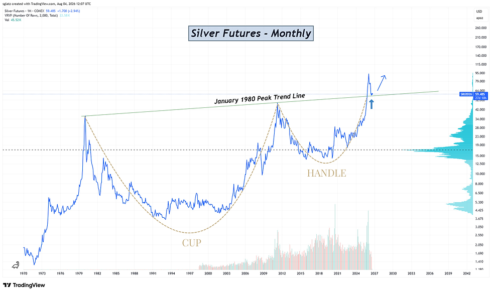
Again, technical analysis and watching charts is not a guarantee that anything will happen.
But it can skew the risk/reward in our favor when done properly and consistently.
This is one of the reasons we have automated pattern recognition as part of our daily investment process.
The third commodity exposure in client portfolios now is copper.
Copper is a metal used in a wide variety of industrial products and applications.
In fact, there was a time when copper was referred to as "Dr. Copper", suggesting it was so good at predicting the economic environment that traders used to suggest that it has a PhD in economics.
One of the metrics we use in our investment process is to look at relative returns.
Relative returns are important when comparing the performance of an asset with another.
This is a visual way to view what we will discuss next...correlation.
The chart below looks at the relative performance of COPX to the S&P 500 Index (SPX). COPX is an ETF composed of 45 copper mining companies.
When the chart below goes up, COPX is outperforming the S&P 500 Index, and vice-versa.
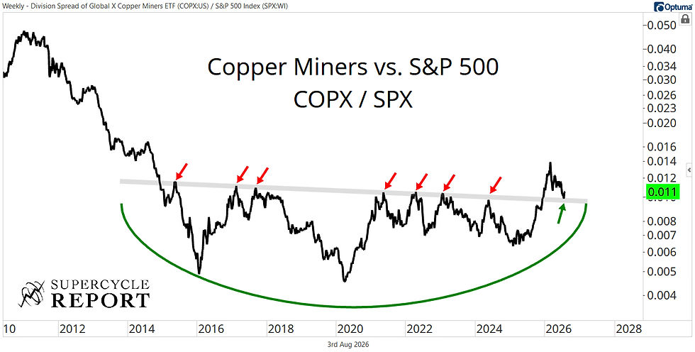
Since 2015, COPX has essentially been performing the same as the S&P 500. That is shown by the chart moving sideways.
However, earlier this year the trend flipped.
The red arrows show levels where COPX consistently turned lower relative to the S&P 500.
Prices broke above the grey line connecting those red arrows, tested that breakout line, and now looks ready to embark on an extended period of outperformance over stocks.
Like the other metals, copper looks attractive in our system, the fundamentals support demand now and over the coming years, the charts look constructive and the relative setup is in place.
All of these factors contribute to increasing the allocation of metals relative to stocks in client portfolios, even if that means the possibility of more unpredictable short-term moves in portfolios.
With recent shifts from stocks to commodities, you may notice that your portfolio does not go up and down with the market like it used to.
Precious metals tend to move independently of stocks.
At times, stocks and metals perform the same.
One goes up and the other one goes up as well.
And vice-versa.
When two assets perform similarly over the same timeframe, that is called "correlation".
There are three types of correlation:
Positive Correlation
Negative Correlation
No Correlation
Positive correlation means that if stocks go up, your portfolio goes up as well. This is what we almost always think is the case with a portfolio.
Negative correlation happens when stocks go up and your portfolio goes down. A negative correlation means it moves in the exact opposite of the other asset. An example of negative correlation is if we short the market in order to profit on falling prices.
Having no correlation means there is no statistical way to predict what will happen to a portfolio if stocks go up or down.
That's where we are right now.
Markets can go up, and so can your portfolio.
Markets can go down, and so can your portfolio.
But markets can also go down, and your portfolio goes up. That has happened plenty over the past few months.
It also means the market can go up, and your portfolio goes down. That has also happened plenty lately.
Try not to let this bother you. (I know it is easier said than done.)
But our signals have been telling us to shift to metals as the longer-term cycle potentially changes in favor of commodities over stocks.
We have discussed this at length over the past few years, most recently in our 2025 mid-year Outlook report from last summer: https://www.ironbridge360.com/post/2025-mid-year-outlook-webinar
Interest rates are one of the largest influences on financial markets globally.
They are the tail that wags the dog.
The reason interest rates are so important to stocks is they control the cost of capital.
As the cost of debt rises, it cause
Profits to fall
Costs to go up
Projects to become more expensive to fund, slowing and sometimes stopping economic activity
Interest rate cycles are LONG cycles.
The next chart below shows the 30-year US Treasury yield.
The chart starts in 1944 on the left side of the chart and goes to today on the right.
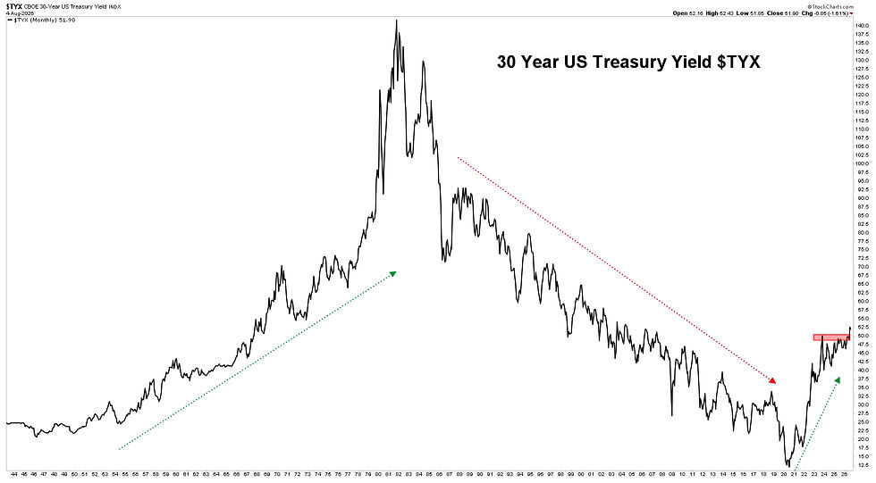
As shown in this chart, interest cycles are long cycles.
They tend to rise for 30 years, then fall for 30 years.
Interest rates fell from 1982 to 2022.
40 years of a 30-year cycle.
Interest rates are 10-years behind the curve for when the cycle should have turned.
So they are playing catch-up.
Long-term rates are exploding higher, with the 30-year yield in the US now topping 5.3%.
If rates do go down from here, don't expect to see 3% mortgages any time soon.
The interest cycle points to a more difficult investing environment over the next decade if historical trends continue. During the last two rising interest rate cycles, stocks were flat for 15 years.
Interest rates are a risk to stocks, but will provide interesting opportunities in the safer areas of the financial markets.
Markets are behaving well on the surface, but our system has been allocating away from stocks in favor of commodities.
Near-term, moderate upside potential still remains.
But we are anticipating a change of leadership to emerge within markets, away from the S&P 500 being the dominant index.
Leadership likely changes from large cap US stocks to smaller US companies, international stocks and commodities.
Stay nimble, and try to avoid the landmines that inevitably will show up.
Invest wisely!