


May 191 min read


Apr 36 min read


Nov 4, 202510 min read

Markets have been choppy, following increased geopolitical tension in Iran and elsewhere.
The stock market and the US Dollar Index are currently sitting at a levels that could serve as inflection points for the next year or two.
Which way will it go?
Despite what feels like extreme volatility, markets have not been as negative as they could be.
The S&P 500 Index fell 10% from its recent highs in January, and is currently 7.5% off all-time highs.
This is a very normal decline to experience each year.
Yes, it feels worse.
Frankly. it feels like prices should be down 20-30% or more.
But they aren't. They are only down 7.5%.
Strangely, if things WERE worse, and if volatility WERE higher, we might be more optimistic.
Last year, during the tariff sell-off in April, stocks were very volatile, and a low developed quickly and decisively. Volatility spiked to nearly 80, satisfying the bears that enough damage had been done.
The rest of the year became relatively easy.
Market prices soared and volatility was essentially done for the year.
Granted, last year's decline hit 20% from peak-to-trough, double this year's decline.
But today's volatility has been more contained.
The VIX spiked, but only up to 30.
We're now in an area where small pullbacks can stop, but where big pullbacks can start.
Let's look at some charts.
Our first chart is of the S&P 500 Index.

Over the past two weeks, stocks have broken shorter-term support, and have rallied back to that level. On the chart, we are referencing the part just under the shaded blue area.
This is potentially a warning signal.
Emphasis on "potentially".
It does not mean that we are destined to have a large decline.
But, between wars, increasing exposure of massive government corruption, and worries in tech and private credit, markets could easily experience a larger decline if it wants to.
More on these issues below.
Back to the chart.
The selloff so far has been orderly, contained, and moderate. It felt bad, but the overall damage has not been very big.
The decline from the all-time highs in January does not look fully complete. This is shown in the red on the right side of the chart below.
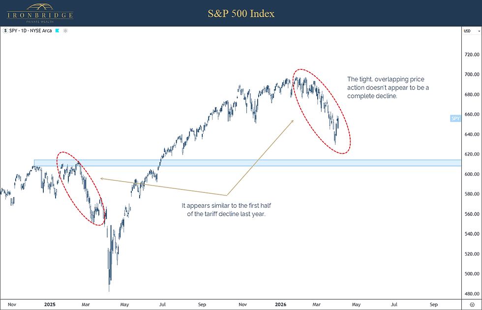
The decline could very well be over, and new highs could be immediately on deck.
But since the damage has not been that bad, and the "look" doesn't quite match a completed pullback, further downside is absolutely on the table in the near term.
This puts stocks in a strange position:
On one hand, the market has shown enough volatility that a pullback could be complete, or nearly complete;
On the other hand, we have not seen extreme volatility that suggests with much certainty that we have seen the lows for this decline.
This leaves various scenarios on the table.
One thing we find helpful to do is to simply map out different possible paths market prices may take.
There are literally unlimited scenarios, and thinking that we can map out prices accurately is the job of a fool.
But technical analysis (looking at charts), can help identify areas that other market participants find important. Chart patterns, after all, are visual representations of human behavior towards that investment.
Human behavior repeats itself consistently. Particularly our stupid behavior. This is why chart patterns repeat themselves consistently.
Let's look at three of the possibilities right now.

Scenario 1: Bull Market Resumes Immediately (30% likelihood)
This seems unlikely without a little more development of the pattern, but this could simply be a normal 10% correction.
If that is the case, we would expect a rally to test 7000 over the next 1-2 months, and the market would determine what it wanted to do at that level.
Scenario 2: Further Down, Then Higher (50% likelihood)
We estimate this as the likely scenario, but that estimate is pure guess based on experience with previous declines.
This pattern could develop if the Iran war wraps up in the next few weeks without major damage done to the global economy.
Scenario 3: Bear Market (20% likelihood)
This scenario assumes more chaos develops, which absolutely could happen.
The likelihood of this scenario could increase dramatically depending on what develops around geopolitics and corruption.
We are never afraid to bluntly state that we have no idea which scenario will happen.
We have been raising cash across client portfolios over the past 6 weeks as our signals have dictated.
While the S&P 500 index is always the most important index to watch, two other areas to watch are small cap stocks and the US Dollar index.
One of the areas of the market that is showing the cleanest risk/reward levels are small cap US stocks.
Our next chart looks at the Russell 2000 index, the most common small cap index in the US.

From 2021 to 2025, the small cap ETF in the chart above (ticker IWM) traded in a range between 160 and 240.
Then around the end of 2025, it decisively broke higher.
Now, it has revisited the breakout levels by pulling back to the 240 level.
What it does here is very important.
Stabilizing here would be an excellent sign that the retest will hold. It is important that it holds, because if it can spring higher from here, it would signal that the bulls have resumed control of financial markets.
However, if these levels don't hold, there is no real support on the chart until 200, suggesting almost 20% downside if current levels fail.
This is an incredibly important market to watch.
The other incredibly important market to watch is the US Dollar index.
The US Dollar influences prices of nearly every asset on the planet.

Like small caps, the US Dollar index is also at an important level.
If prices can stay under 100, and begin to move lower, this should coincide with small caps holding their lows and stocks and commodities generally moving higher.
However, if the dollar breaks through the 100 level and sustains a move higher, all bets are off.
A strengthening dollar could cause stocks to have another leg lower. Possibly a major one.
So we must remain aware to bad scenarios that could happen from here.
The US Dollar is where the intersection of geopolitics and corruption meet the stock and bond markets.
We aren't getting into the weeds today. We simply want to mention that when we discuss corruption in the future, we are not viewing the world through a Democrat vs Republican lens.
We are viewing it through a Criminals vs Victims lens.
And from the appearance, LOTS of politicians on both sides have been Criminals.
The extent of the lies and theft truly appears unbelievable.
This poses the single biggest threat to financial markets, in Jim's opinion.
We have mentioned this previously, but corruption appears to be so large that it is a legitimate possibility that both the IRS and the Federal Reserve no longer exist in the next few years.
Throw in a constitutional crisis and you have the makings of total chaos. At least until it gets cleaned up. Then things could be amazingly good.
Buckle up. And don't get too emotionally attached to any politician...they may be in an orange jumpsuit soon.
One can hope, at least.
Our signals have raised cash and quietly reduced equity exposure.
Keep in mind, when discussing positioning, your portfolio may vary slightly, depending on how long we have been working together and your specific objectives.
But generally speaking, we have seen the following things happen in portfolios as a result of our system:
Reduction of US stocks in favor of international stocks
Reduction of stocks in favor of cash
Reduction of technology stock exposure in favor of commodities (gold, silver, copper, agricultural).
Our risk-managed index strategy is currently in cash in ticker FTSM.
Our sector rotation strategy is 75% cash (ticker SHV), 25% materials sector.
Equity strategy is 13% cash (ticker BIL).
Fixed income exposure is short-term, high-quality bonds and notes.
We have added crypto exposure to portfolio as the potential for certain crypto-currencies to replace global payment transfer systems looks to be a real possibility. This is a hedge against failure of the current financial system.
Roughly speaking, this puts cash levels anywhere from 20-35% of total portfolio value, which would otherwise be invested in stocks.
Client portfolio returns are mostly positive for the year, following a strong year in 2025, despite markets being lower year-to-date.
We will continue to monitor our signals and adjust as necessary.
Developments have resulted in increased cash in portfolios, and risks in general have increased.
However, that doesn't mean that bad things must happen in markets.
But that potential has changed our exposure from a tech and US-stock heavy portfolio to one more balanced across cash, stocks and commodities.
As always, please do not hesitate to reach out with any questions.
We will schedule our second quarter webinar sometime in the next week or two.
Today, on Good Friday, let us remember the sacrifice our Lord and Savior Jesus Christ made for all of us.
Invest wisely!